Modern, clean HR dashboard design with white, green, and red color scheme.


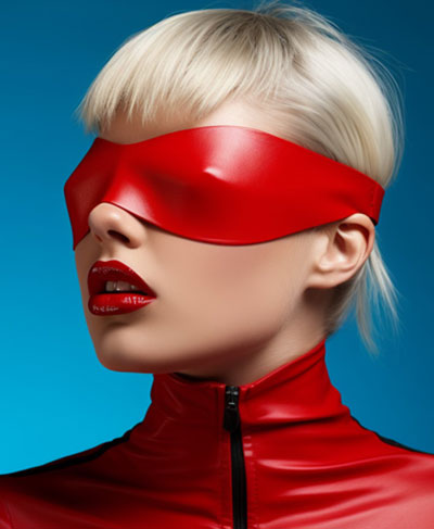
 Midjourney
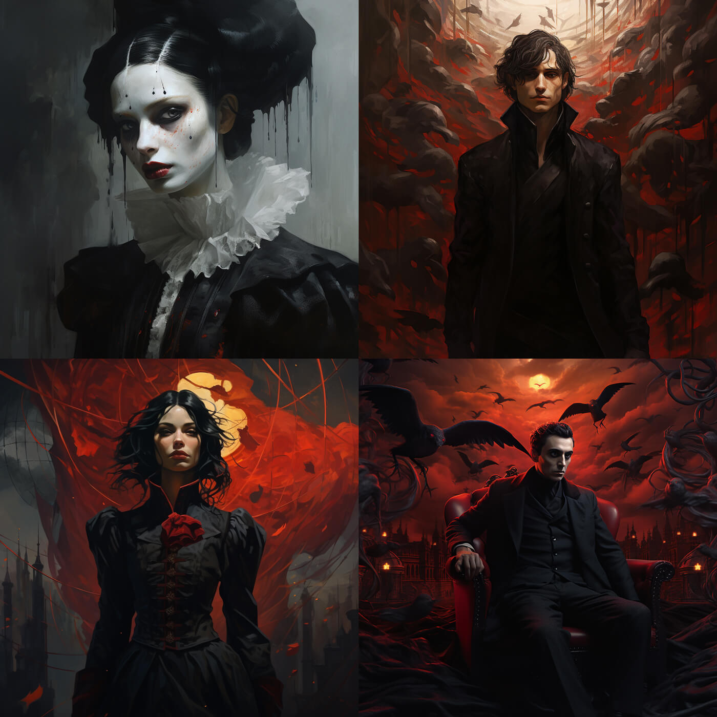
 Pinterest
  Facebook
 Twitter
Copy the prompt below to render similar images
clean and modern web dashboard design with a color scheme predominantly in shades of white, green, and hints of red. The interface appears to be part of an HR management system, named "Humanline." On the left, there is a vertical navigation menu with icons for Dashboard, Employees, Checklist, Time Off, Attendance, Payroll, Performance, Recruitment, Help Center, and Settings. There's also a toggle at the bottom of this menu to switch between light and dark mode, indicating a UI feature that allows users to choose their preferred theme. The main content area displays the "Employee Data Reports" section. It includes a pie chart showing the age profile of employees, with a legend indicating 65% male and 35% female. Below the chart, there's a table listing employees with columns for Employee Name, ID, Department, Job Title, Gender, and Status. Each row has an 'Active', 'Onboarding', 'Probation', or 'On Leave' status indicator. At the top of the page, there are other navigation links for Documents, News, Payslip, and Report, suggesting additional sections of the HR platform. There's also a search bar for quick navigation, and a 'Download Data' button at the top right of the reports section, allowing users to export the displayed information. The design focuses on usability with a clear structure and easily distinguishable sections. The dashboard seems user-friendly with a modern aesthetic that would be suitable for a professional setting.


Attribution is required to use images for personal and
commercial use
Similar Prompts


View Limit Reached!
Upgrade for premium prompts, full browsing, unlimited bookmarks, and more.
 Premium

Become a member
Sign up to copy & bookmark prompts.
It's absolutely FREE
 Sign in or Sign up using Google
Limit Reached
Upgrade for premium prompts, full browsing, unlimited bookmarks, and more. Create up to 2000 AI images and download up to 3000 monthly
Premium
 Premium